January 2, 2007, - 4:32 pm
Ix-Nay on the New Wall Street Journal Design
By Debbie Schlussel
As a religious Wall Street Journal reader, I was a bit disappointed with today’s newly re-designed version of the print edition. The paper’s been hyping the “makeover” in the media for quite some time.
I know everything must change “with the times,” but change must also come for a reason. And it should be for the better. The paper is the best daily print publication in America (probably the world), with interesting stories and great editorials and op-eds (except on immigration and foreign investment in vital American entities). As I tritely often write on this site, “If it ain’t broke . . . .”
My biggest problem with the new re-design is that they’ve moved the “Letters to the Editor” to the back of the Marketplace section. It’s like moving meat to the back of the dietary supplements section of the supermarket. The whole reason people write letters to the editor is to be heard–to have those who read the original pieces, to which they’re responding, read their letters. They want to make a cameo in the show, not get a seat in the stands.

The letters belong on the op-ed page, where they used to be before the re-design. Now, in the back of a section on business marketing and trends, no-one will see or read them. Not good.
Then, there’s the size. The Wall Street Journal shrunk the size of the paper, ostensibly to keep up with all the other newspapers that have shrunk to a new standard size (and this will also save the Dow Jones Co. money in reduced paper costs due to less paper).
But with that shrinkage comes less on the front page. Those wonderful, interesting stories that frequently populate the front-page have shrunk, too. There’s less of them. I noted that it took me far less time to get through the paper, this morning. But it also made me think I was reading much smaller content. Perhaps the typeface hasn’t really shrunken in size, and it’s just the shrunken size of the newspaper that is playing tricks with my eyes. But either the typeface is smaller or there’s less content. It must be one or the other, given the new, much smaller pages. It appears that there is at least one column less per page.
As for the increased colors, graphics, bells, and whistles, if they think that this will increase the paper’s appeal to a younger audience, good luck. The Wall Street Journal is all about content–the written content. Younger audiences will read it for that, if they read it at all . . . not for the color and graphics, which really aren’t that modern, appealing, or different. The rest will stick to not reading newspapers–WSJ or otherwise. This new re-design won’t stop the death of newspapers in America, or even slow it.
It’s only the first day of the new format. I’m sure, like with many publication re-designs, I’ll get used to it. But they really do need to move the Letters to the Editor back to the op-ed page, where they belong.
Since the Journal is one of the most read newspapers in America (it’s in the top three with USA Today and the New York Times), one assumes the paper did market research with readers and potential readers. Given the new design, I’m not sure.
It might be like “New Coke.”
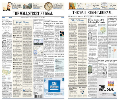
**** UPDATE: Reader Paul alerts me to these pics of the old (left) and new (right) Wall Street Journals, from NewsDesigner.com:

Tags: America, dietary supplements, Dow Jones Co., editor, The New York Times, the Wall Street Journal, USA Today, Wall Street Journal


I always hated how huge the pages in the WSJ were – I like to spread the paper out on the table while having a meal, and those massive pages just took up so much space. I might actually get a subscription now.
Dan on January 2, 2007 at 6:43 pm